We’re currently working on the design of our website. Thank you for your patience!
The client provided minimal input on the design, requiring me to take the initiative to create a concept that aligns with their brand. Additionally, with 108 pages to design, scalability and efficiency were critical challenges.
Problem
Objective
To develop a reusable and visually appealing design system that saves time during development, maintains consistency across all pages, and reflects APL Forward’s brand identity and cultural relevance.
OVERVIEW
BRAND DESIGN | WEB DESIGN
APL Forward: Streamlining Global Freight Solutions
APL Forward is a China-based freight forwarding company specializing in efficient logistics and transportation services. They assist businesses and individuals in shipping goods across domestic and international borders by managing critical processes such as customs clearance, documentation, and cargo handling.
Solution
Reusable Design System: Developed modular templates and components for easy replication across 108 pages, saving time and ensuring consistency.
Culturally Relevant Aesthetic: Used a red-themed design to align with Chinese cultural preferences, balanced with clean white space for visual clarity.
Efficient Workflow: Designed layouts with pre-set styles and clear hierarchies to simplify development and speed up implementation.
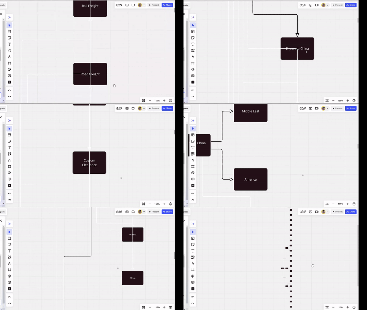

I created the APL Forward workflow by analyzing and organizing 108 pages of content into six main categories—Home, Services, Ship From China To, About Us, Resources, and Special Services—breaking each into subcategories like Sea Freight, Asia, and Country Guides, and designing a clear, visually structured flowchart to ensure easy navigation and accessibility.
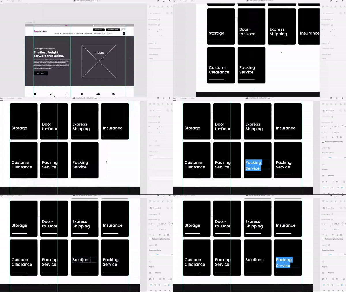

My design process begins with creating a wireframe for the homepage, followed by a subpage wireframe to establish reusable dynamic content; I then wait for final approval before proceeding with other pages to save time and resources since it's a 108 page design.
I used the Poppins font, known for its clean, geometric style and excellent readability across digital platforms. This choice ensures the website remains approachable while maintaining a professional tone.
ABCDEFGHIJKLM
NOPQRSTUVWXYZ
abcdefghijklm
nopqrstuvwxyz
1234567890
!@#$%^&*()


The color scheme for APL Forward was carefully chosen to represent strength, professionalism, and cultural relevance:
Red (#DF2826): Bold and dynamic, symbolizing success and progress, inspired by Chinese culture.
Black (#191919): Sleek and professional, ensuring readability and balance.
Together, these colors create a striking and reliable brand identity.
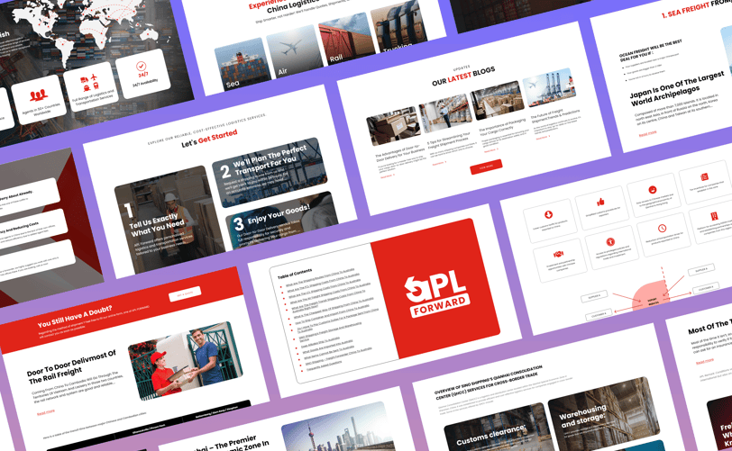
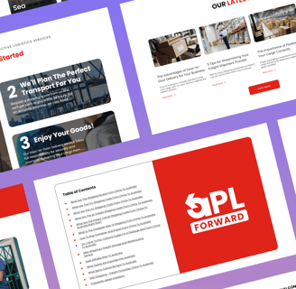
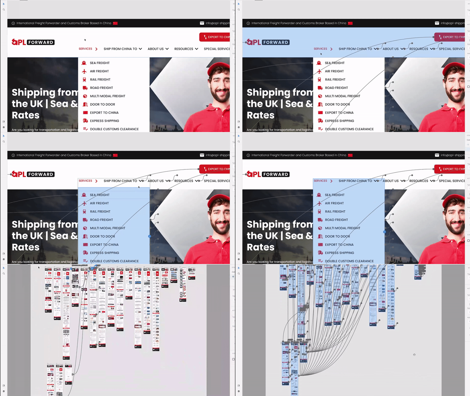

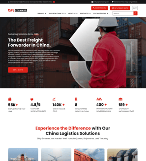
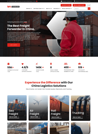
As part of my work with APL Forward, I developed a user-friendly and visually engaging prototype that highlights the company’s core services and features. This prototype was designed to ensure a seamless user experience while maintaining the brand’s professional image.
For a glimpse of the design, you can view the preview link here:
Note: The link displays only foundational pages while keeping sensitive project details secure.


